As a Nikon D300 owner I was pretty happy with the default picture control modes of this camera. The standard mode worked well for my everyday point and shoot and the neutral modes for portraits provided good skin tone. But that was until I got curious about the fact that some D300 photographers were missing the D2X picture modes and raving about the fact that now the D2X modes were available for the D300!
So like most Nikon D300 owners, I uploaded the D2X Picture Controls, available on the Nikon Europe site and while I was at it, I uploaded some curves that imitate some Fuji films from This Site.
I wanted to see for myself what were the real differences between all of these picture control modes and see which would serve me the best and for what purpose.
So I took a color card and asked my lovely partner in life to hand model for the skin tone reference. Each photo was shot exactly the same way: Manual Mode, Aperture F9, Shutter Speed 1/80s, 400 ISO and with the same custom White balance.
PS: Nikon's recommendation for achieving a level of brightness similar to that of images captured with the D2X and the D2XS, is to set Picture Control Brightness to -1.
So like most Nikon D300 owners, I uploaded the D2X Picture Controls, available on the Nikon Europe site and while I was at it, I uploaded some curves that imitate some Fuji films from This Site.
I wanted to see for myself what were the real differences between all of these picture control modes and see which would serve me the best and for what purpose.
So I took a color card and asked my lovely partner in life to hand model for the skin tone reference. Each photo was shot exactly the same way: Manual Mode, Aperture F9, Shutter Speed 1/80s, 400 ISO and with the same custom White balance.
I did this comparison board so you could decide for yourself.
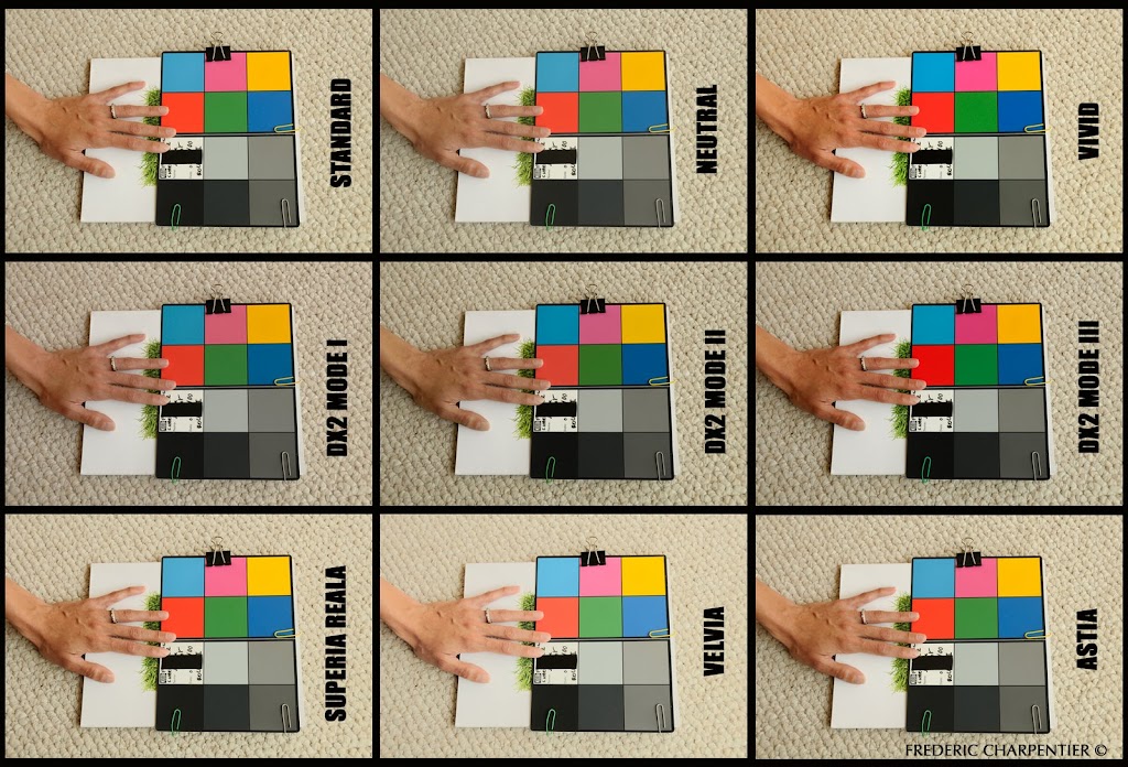
But here are my thoughts:
-Of all the picture control settings, the D2X Mode II is definitely the closest to the real life skin tones of the hand and color test card. The Default Neutral mode comes in second
-I really like the Fuji Astia and the Superia Reala, although this one is a touch too bright, I like them both. They are warm but not too saturated .
-The Velvia was obviously too bright and doesn't look anything like the Fujifilm that I know. One could easily fix this by twesting etc. but I just don't want to be bothered with that. I may just delete it!
-The Vivid default mode. Well too vivid for my taste!
-I can see how the D2X Mode III could be very nice for landscapes, just as Nikon recommended.
So after seeing so many different curves uploads options and discovering some new favorites of my own, I'm saying bye bye to that default standard setting and highly recommend you check this out for yourself. Thank You NIKON!!!
PS: Nikon's recommendation for achieving a level of brightness similar to that of images captured with the D2X and the D2XS, is to set Picture Control Brightness to -1.
2 comments:
I like vivid. I love saturated colors.
Hello!
The best I think the reala's colors... the black is black, the red is normal, not too strong, and the skins tone is naturally, not greeny, and not darker...
BB!
Szabolcs
Post a Comment